When I was using power point to give a presentations in class, I could point out my thoughts and share infomation with others. When I was listenning presentations from other people, I also could recevie their ideas. Some power points can not present their thoughts and main information clearly. When people use power points to do presentations, the power points should have main information and to be succinct and clear.
There are a lot of people are waitting Apple press conference every year. Apple press conference is a fantastic multimedia presentation. It can attract people’s attentions by using good speech skills and perfect power point. Although each slide of the power point is very simple, it shows the most important information that most people want to know.

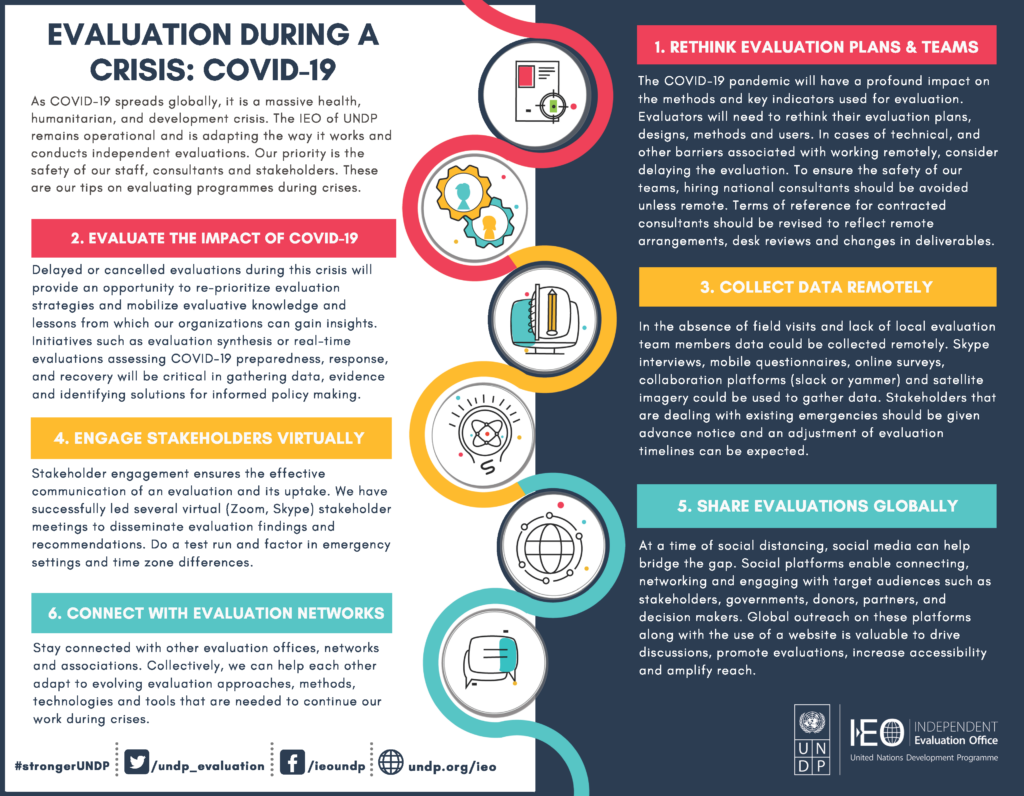
This is a good infographic because it is very clear. When I saw it at beginning, I can know what this designer wants to tell me. The main idea shows intuitivly.
This one is a bad infographic for me. There are too much information in one little infographic. I need to read very carefully so that I can tell what the main idea is.
Reference
Evaluation during crisis – COVID 19. United Nations Development Programme – Evaluation – Infographics – Evaluation During Crisis – COVID19. (n.d.). Retrieved October 12, 2021, from http://web.undp.org/evaluation/media-centre/infographics/evaluation_covid19.shtml.
World Health Organization. (n.d.). Infographics – english. World Health Organization. Retrieved October 12, 2021, from https://www.who.int/singapore/news/infographics—english.